Using the theories drawn upon in my literature work of the areas of history of graphic design, visual culture, cognitive psychology, user interaction and the gestalt theory.
I hope to find that the rules we apply to the web are not all necessarily true and in doing so also finding that the rules we have adopted from society and used within design may not stand strong when placed in to the digital realm. This shall allow me as a designer to have a better focus on areas I have investigated here.
| Entrants | |
| Total | 257 |
| Gender | |
| Female | 125 |
| Male | 124 |
| Age Ranges | |
| 10 and Under | 1 |
| 11 to 17 | 1 |
| 18 to 24 | 17 |
| 25 to 34 | 89 |
| 35 to 44 | 50 |
| 45 to 54 | 29 |
| 55 to 64 | 26 |
| 65 plus | 31 |
| Devices | |
| Laptop | 94 |
| Desktop | 106 |
| Mobile | 37 |
| Ipad | 16 |
| Country of Origin | |
| United Kingdom | 214 |
| France | 4 |
| Guam | 1 |
| Kenya | 1 |
| Trinidad and Tobago | 1 |
| New Zealand | 1 |
| Ireland | 2 |
| United States | 1 |
| Timor-Leste | 1 |
| South Africa | 4 |
| Bolivia | 1 |
| British Indian Ocean Territory | 1 |
| Russian Federation | 1 |
| Poland | 1 |
| Congo | 1 |
| Seychelles | 1 |
| Australia | 2 |
| Canada | 3 |
| United Arab Emirates | 2 |
| United Arab Emirates | 1 |
| Venezuela | 1 |
| South Georgia and the South Sandwich Islands | 1 |
| Germany | 1 |
| Norway | 1 |
| Greece | 1 |
| Spain | 1 |
| Argentina | 1 |
| Pakistan | 1 |
| Belgium | 1 |
Experiment Results
Click here to view the experiment and have a go yourself…
Tools.php
 Results Left to Right: 41 | 52 | 18 | 79 | 56
Expected result prior to testing…
People would be drawn to the illustrative symbols as a familiar icon within the Web environment. I also concluded that the older generation who may not be so familiar with a computer may relate more to the real life object.
Actual results…

Left to Right:
41 | 52 | 18 | 79 | 56
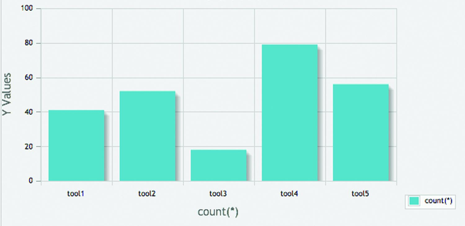
79 people clicked on the image of the real pencil, but closely followed by the illustrative image of the paint brush and the real image of the pen.
Conclusion of results…
This would suggest that people here were drawn most to the familiar items that looked most real, however there was not enough of a significant difference in the results to draw a solid conclusion as the result were split across both real objects and symbols used on the web.
The only low result was the image of the paint brush however I think this is due to the image quality.
What would I do differently…
I would have spent some time taking higher quality images of the real life objects to ensure they are clearly recognised although really I think the only issue was the paint brush which got the lowest click.
Star-Rating.php
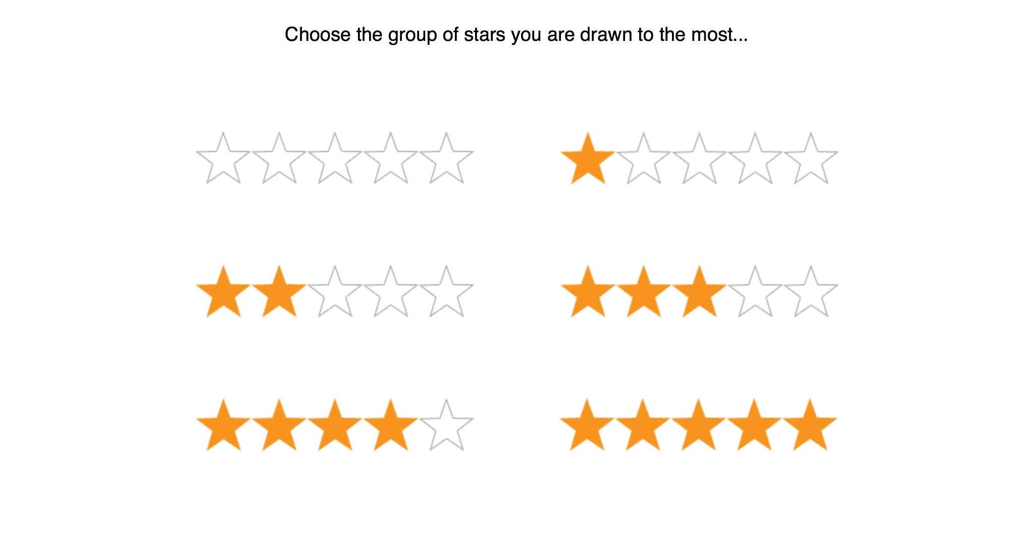 Top Left to Right: 16 | 13 | 9 | 16 | 61 | 133
The influence here came from a culmination of conformity from the Gestalt Theorist movement specifically the work of Solomon Asch. Also the concept came from the increased presence of reviews featuring on websites to draw people to products and be influenced/persuaded to act on it.
Expected results prior to testing…
I expect here that people are more likely to click on the most stars as they would be drawn to popularity/stronger option over weakness.
Actual results…

Top Left to Right:
16 | 13 | 9 | 16 | 61 | 133
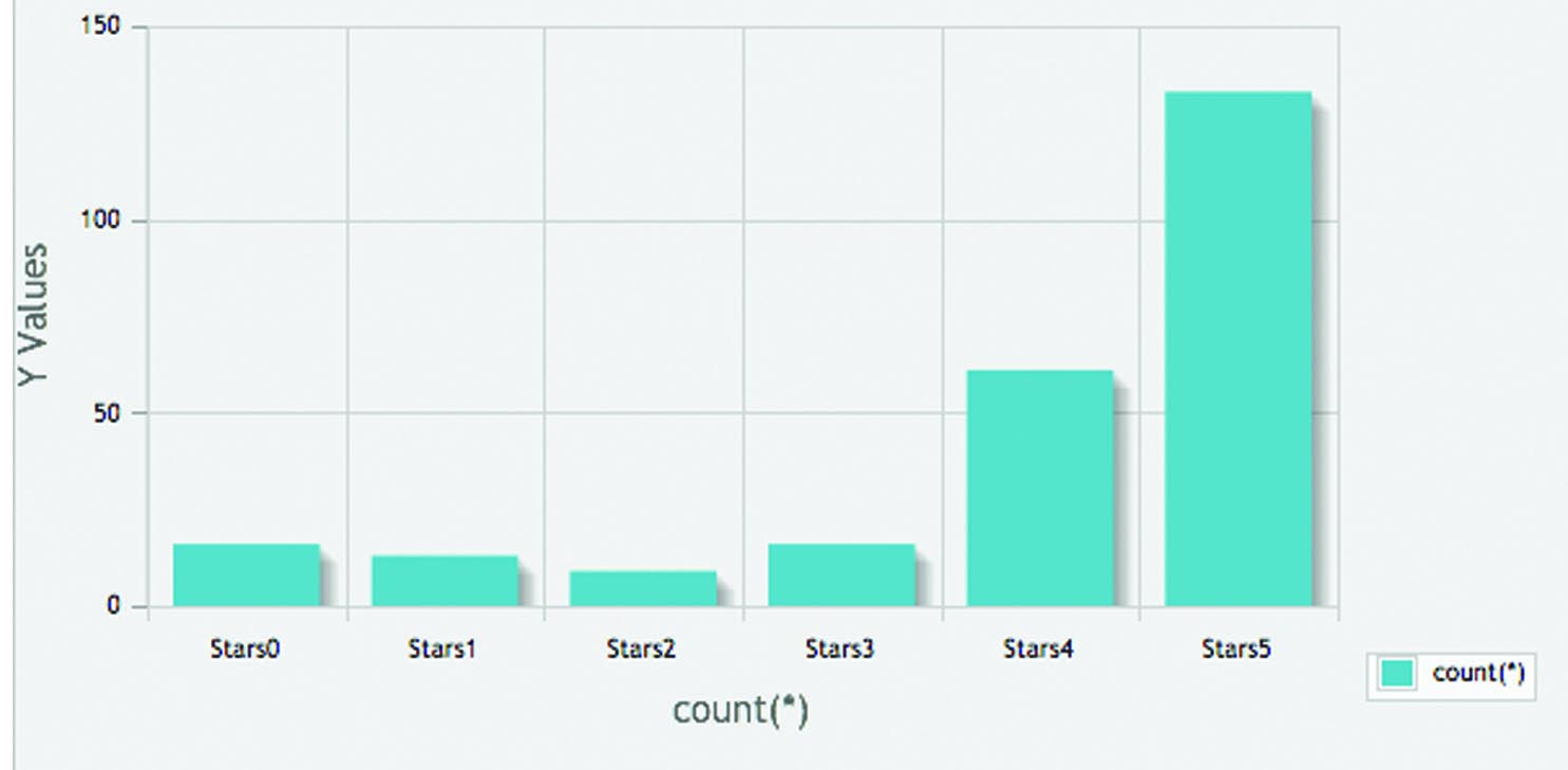
As expected a significantly high number of people clicked on 5 full stars in fact 133 people did as opposed to 16 clicking on the one with all 5 stars blanked, 13 people clicking on the 1 star and 9 people clicking on the 2 star
Conclusion of results…
This shows people are very driven by popularity, strength and positivity.
What would I do differently…
I would not necessarily change anything here as the results were what I expected. I certainly think there are a lot of opportunities to work with conformity which could have a great impact on persuasion and influence of the user.
Pointers.php
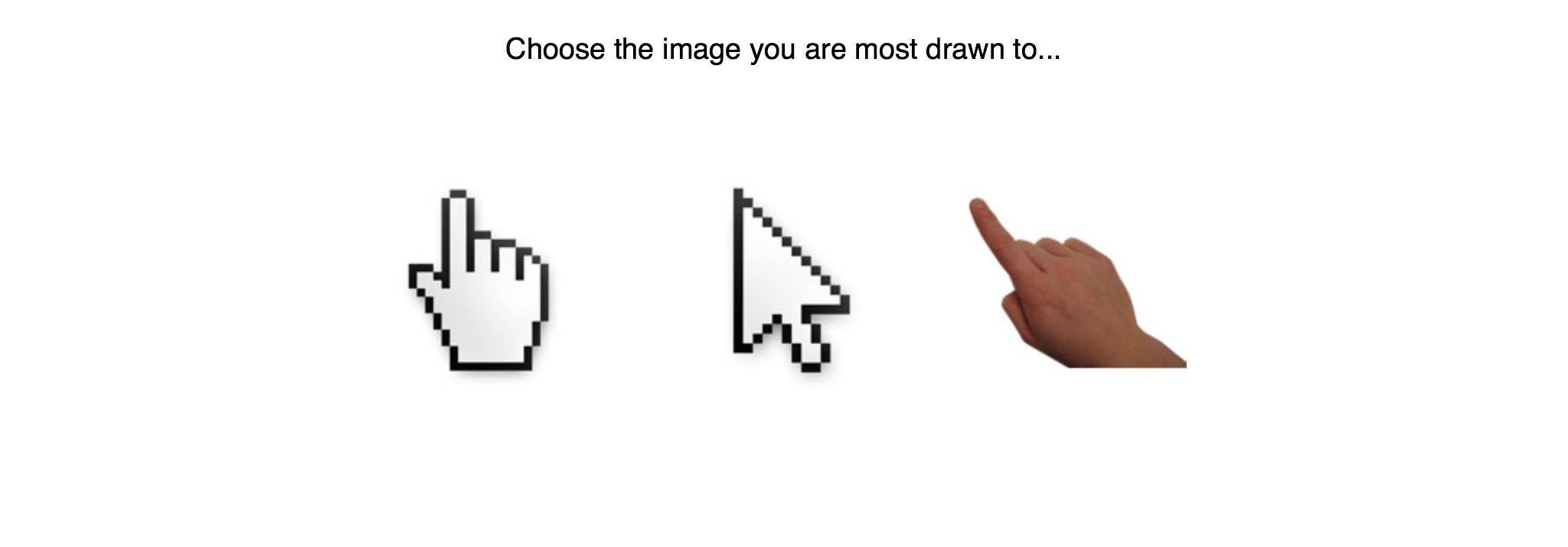
Left to Right: 78 | 64 | 99
The highest number of clicks on one pointer was on the hand icon…in the age range of 25-24.
The highest number clicks on one pointer for the older categories was on the real hand in the 65 plus category
This also focused on if people would relate more to a real life object or a symbol they use and see every time they interact with a computer.
Expected results prior to testing…
As I mentioned earlier I expected here that the results would be split between a real object and an illustrative icon with potentially the younger generation, regular users of computers, being drawn to the symbol/icon and older less frequent computer users being drawn to the real image.
Actual results…
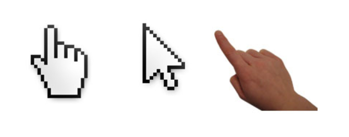
Left to Right:
78 | 64 | 99
The highest number of clicks was on the hand icon…in the age range of 25-24.
The highest number clicks for the older categories was 21 in the 65 plus category
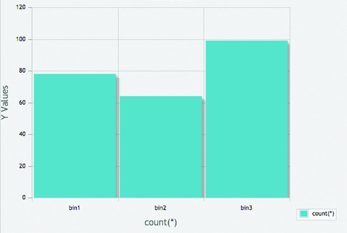
A larger number of people clicked on the real hand here, although there was still a high number click on the other two icons
Conclusion of results…
This indicates that people have more an affinity to a real hand pointed than a symbol. However as the results are generally high throughout it would be hard to conclude here if the cursor really matters. I would also consider that the action of clicking plays a more important role here rather than the icon.
What would I do differently…
In light of my last comment I would have liked to have presented more options here and possibly tested some more obscure icons to draw a conclusion on the significant of the cursor icons importance.
All facial pages
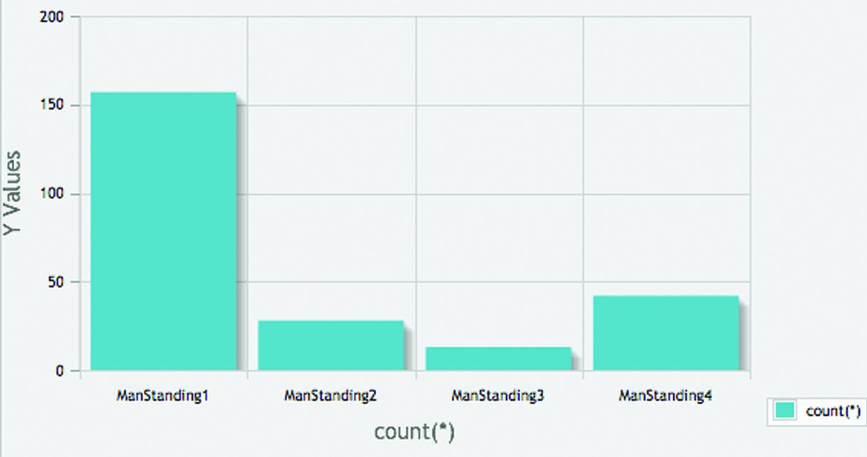
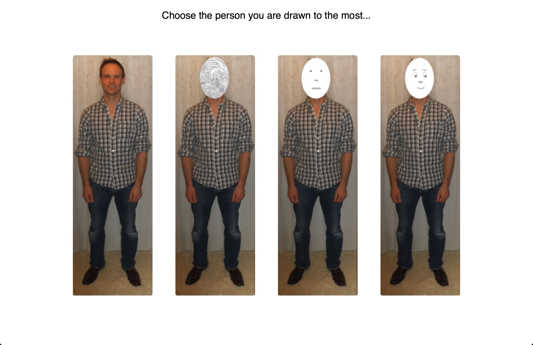 Results Left to Right: 157 | 28 | 13 | 42
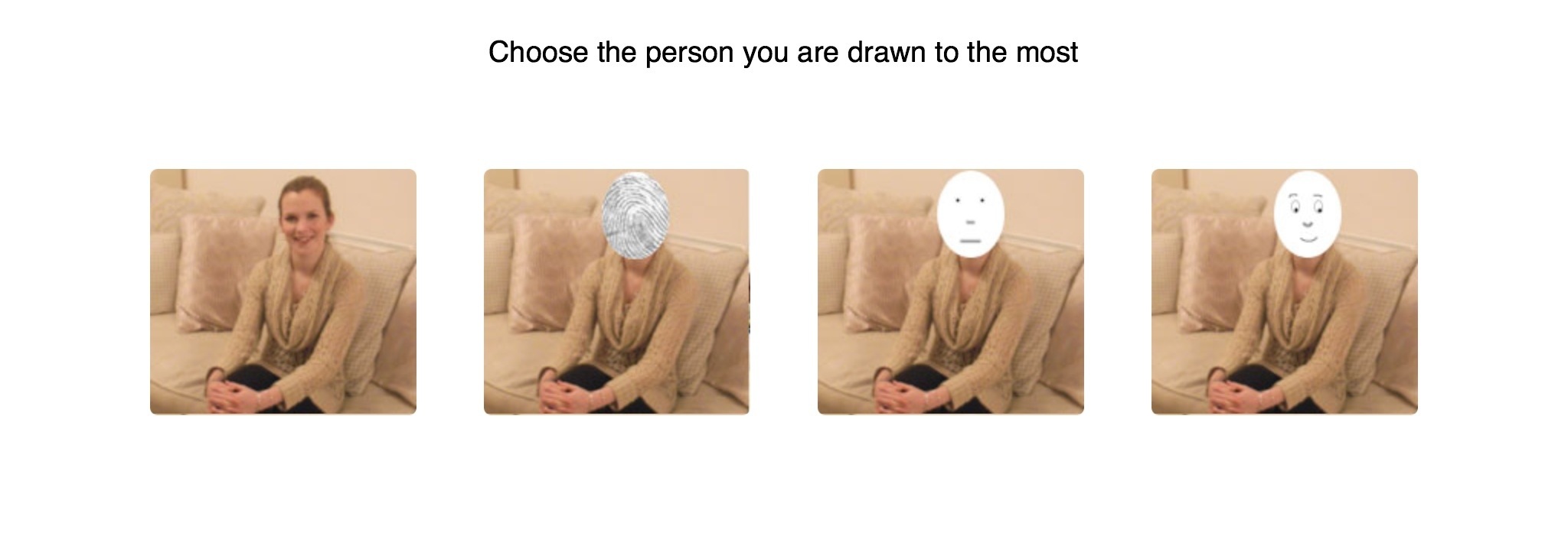 Results Left to Right: 179 | 19 | 9 | 34
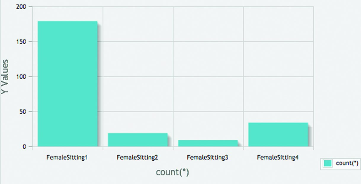
Investigating if people are drawn to real faces of people, or are we likely to relate to a face which we can put ourselves in to making the experience more personal as discussed by Scott McCloud in Understanding Comics. The Invisible Art. ‘We see ourselves in everything.’ ‘…when you look at a photo or a realistic drawing of a face you see it as a face of another…but when you enter the world of the cartoon you see yourself.’ (p.36)
Expected results…
I expected for people to click on the lined drawn plain face with no expression to reflect McCloud’s theory.
Actual results…
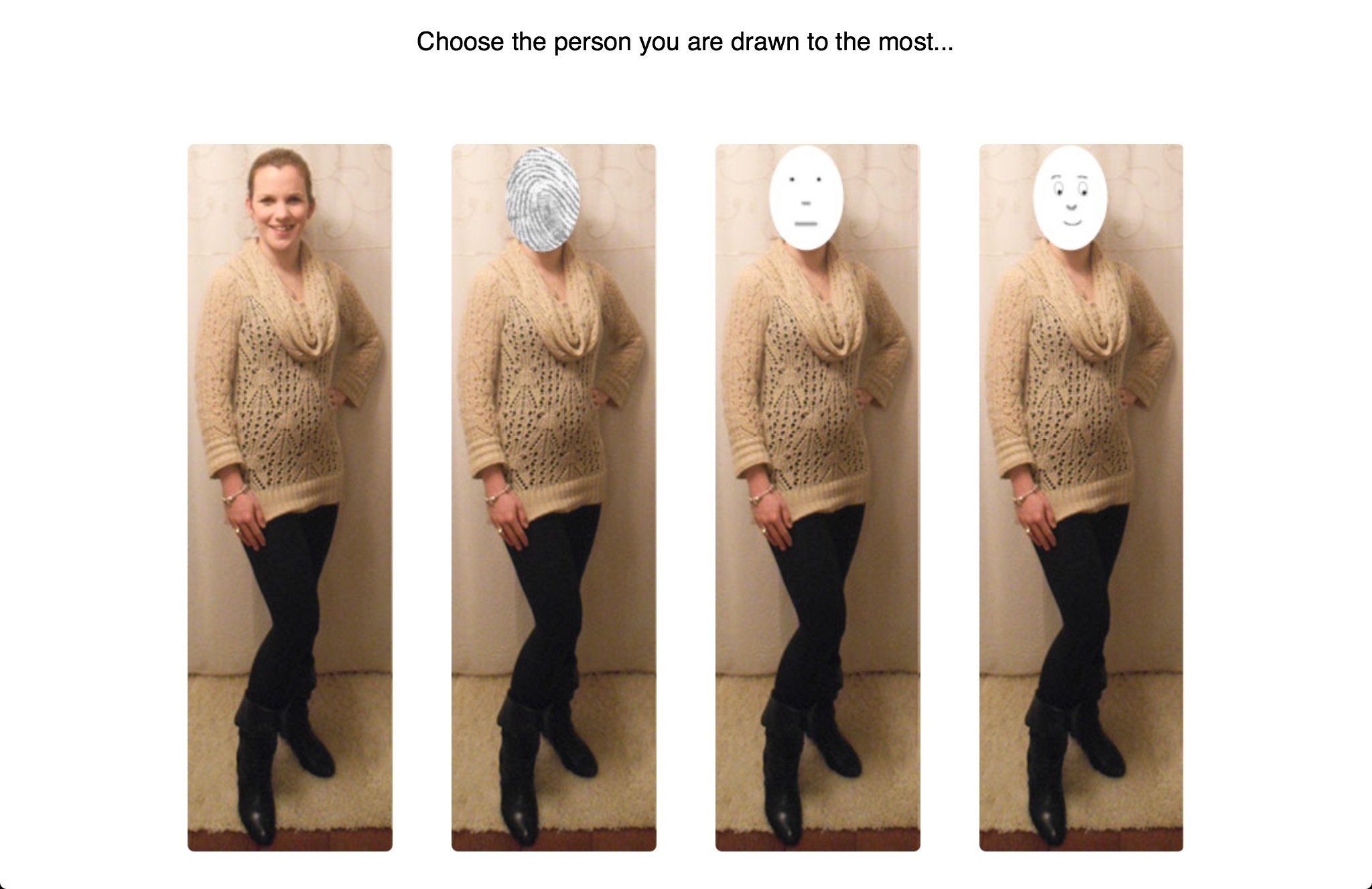 Results Left to Right: 182 | 28 | 9 | 29
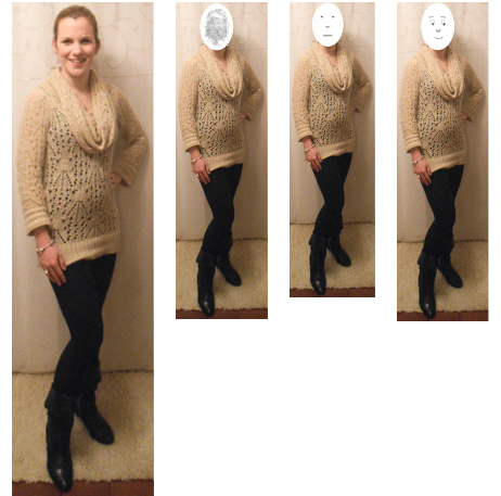
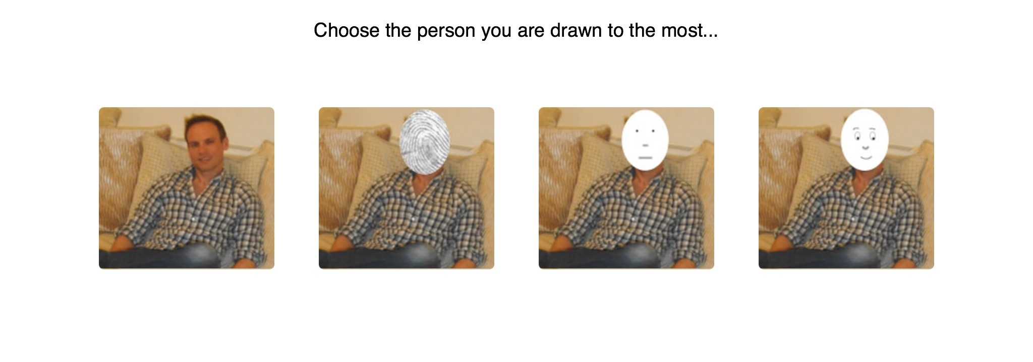 Results Left to Right: 154 | 25 | 16 | 50

The majority of people clicked on the actual face of the person, although interestingly the second most clicked, by still a significantly amount was the illustrative drawn face smiling.
Conclusions…
This would suggest that the reality is far more powerful that the illustrative, imaginative image. Although I could conclude also that people respond to happier expressions then plain due to the second most popular selection being that of the illustrated smiling face with slight detail and character included.
What would I do differently…
The significantly large number of clicks on the human face may be a result of people recognising this to be myself and my husband, those who know us are more likely to click on a familiar face. Although this too is an interesting study as a continuation I may include unfamiliar faces. This said however I would suggest that only appropriately 30-40% of the entrants knew us, the rest would not have known that was us.
Faces looking towards a button
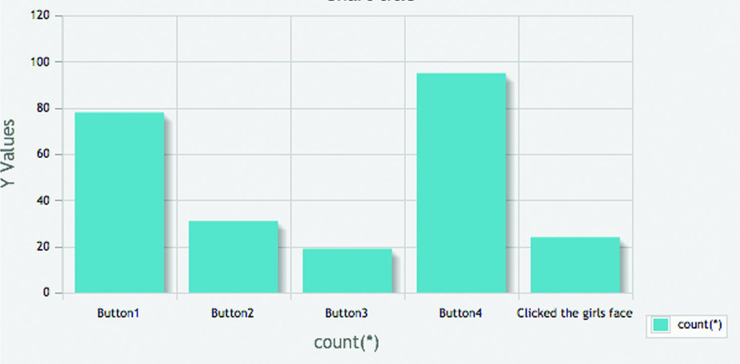
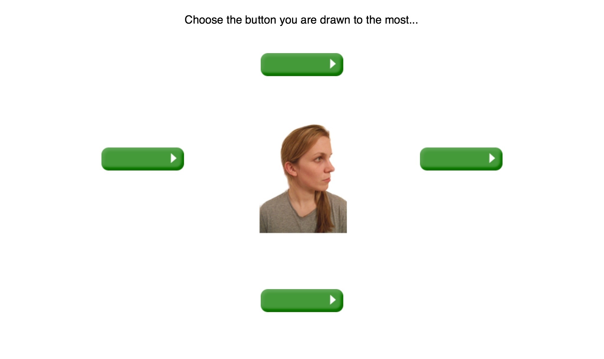 Results from Top going Clockwise: 78 | 95 | 19 | 31 | Clicks on face 24
This is looking in to influence and persuasion as my research question highlights. I wanting to see here if people are influenced by a face looking at a particular object to therefore click what the face looks at or to rebel and do the opposite.
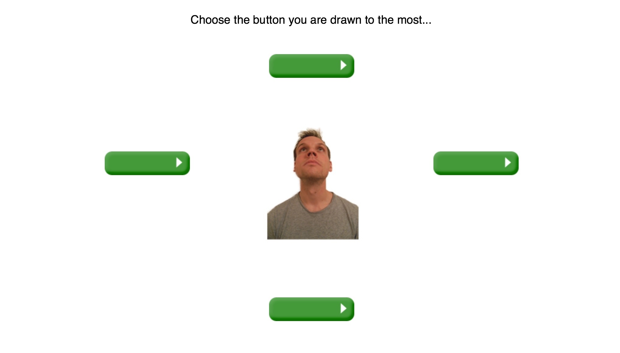 Results from Top going Clockwise: 100 | 65 | 37 | 30 | Clicks on face 12
Expected Results
According to Susan M Weinschenk in her book 100 Things Every Designer Needs to Know About People, this type of experiment would highlight her theories of eye tracking that if a person on a web page looks towards an object the viewer is more likely to follow and respond in the same way, “Eye-tracking research shows that if a picture of a face looks away from us and towards a product on a Web page, then we tend to also look at the product.” p9
In light of this theory I was unsure if people would realise this and actually consciously do the opposite or whether they would conform.
Actual Results…
Results for the female looking right from Top going Clockwise: 78 | 95 | 19 | 31 | Clicks on face 24
Results from the male looking up from Top going Clockwise: 100 | 65 | 37 | 30 | Clicks on face 12
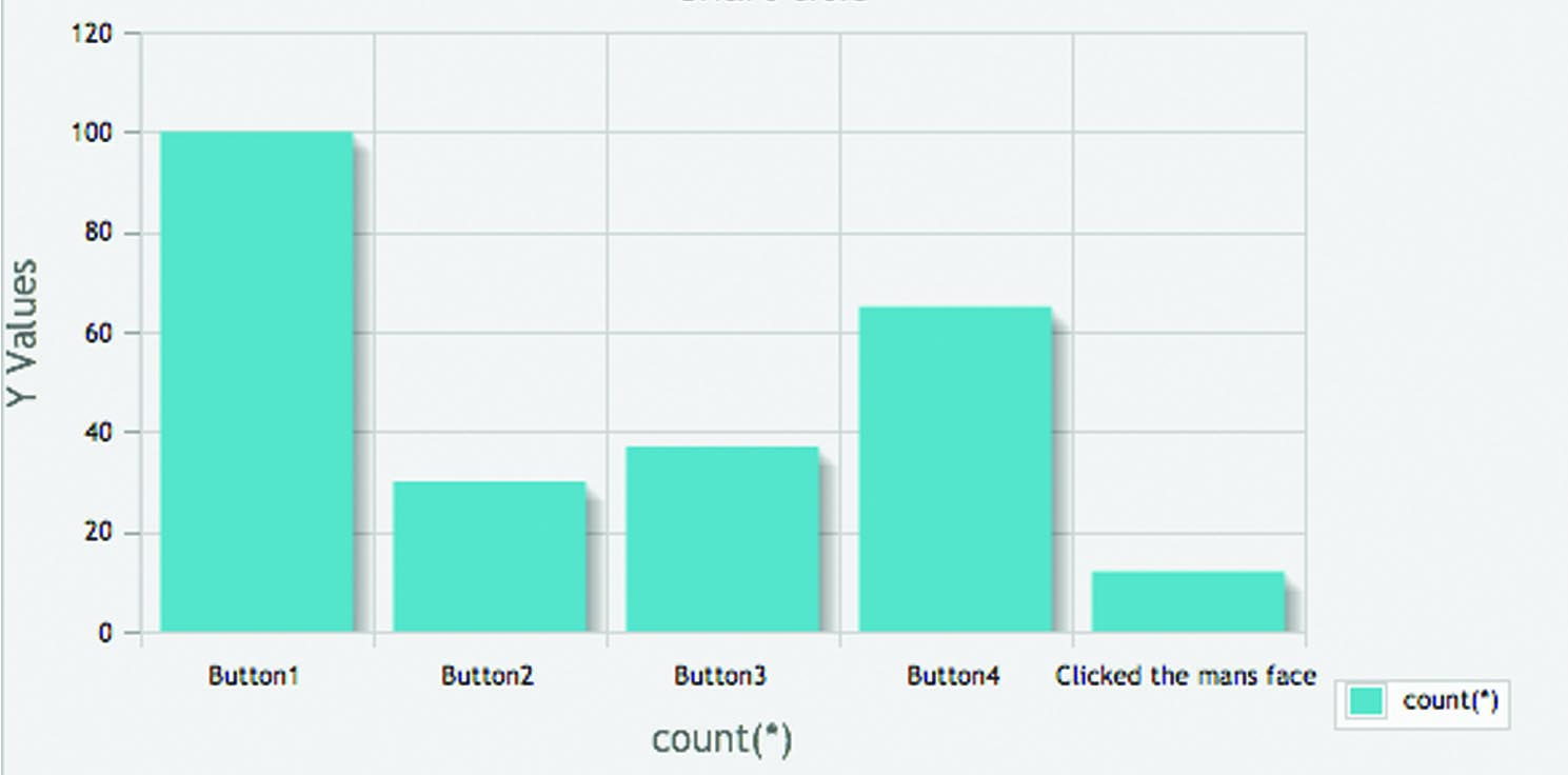
Showing that the majority clicked on the button that the face was looking at.
Conclusion…
Despite feedback from participants claiming with these two pages they wanted to click on the opposite of where the face was looking the results still showed a significant proportion being influenced.
What would I do differently…
I would like to expand this further and see if the user can be influenced by colours and location alongside eye tracking to see if the user can be manipulated to behave exactly as intended by placement and presentation.
Lines.php
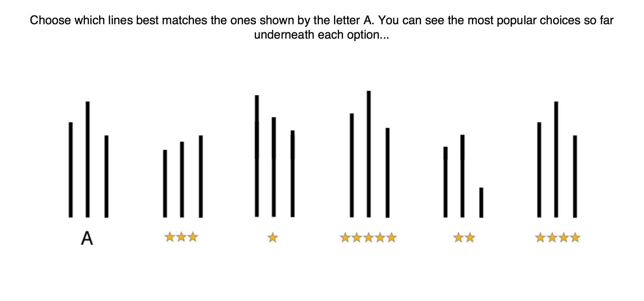 Results Left to Right: 6 | 8 | 60 | 3 | 145
In line with the studies conducted by Solomon Asch with regards to conformity, although his aim was to prove people were largely independent and found this not to be true as the majority of the subjects conformed. I was interested in investigating this similar theory immersed in to the digital realm. Using the increasingly popular review stars to try and persuade the user I wanted to present a series of lines, subject A being the test to which of the other set of lines match. Underneath each line was stars, placed supposedly to indicate which of the lines were most popular choice to match subject A. However the most popular was deliberately wrong and done so to see if people would conform despite it being incorrect or work it out for themselves and not follow the crowd.
Expected Results…
Taking in to account Solomon Asch’s studies and the little time people spend on each page of a website I expected that the results would go with the ‘most popular’ option. Although I would like to see some conformity to happen.
Actual Results…
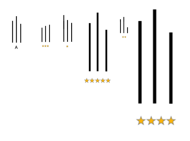
Results Left to Right: 6 | 8 | 60 | 3 | 145
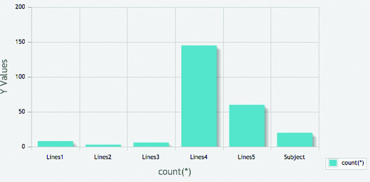
The actual results showed people in fact chose the correct collection of lines and did not go with the most choice. However still a significant number were mislead and conformed with the crowd.
Conclusion…
I would conclude that this would suggest as Asch originally claimed that we are largely independent in the choices we make however further studies would need to undertaken to draw a solid conclusion on this as interestingly the second most popular selection was infact the fake ‘correct’ answer.
What would I do differently…
I feel strongly that if the stars had been significantly different from the actual correct choice, then this would have had a greater impact on how much people conformed. Because the correct choice was the favourite I believe people were more inclined to go with their instinct however users can still be mislead if the artefact is cleverly produced. To investigate this further I would certainly make the correct and fake correct results significantly different and placed further apart from each other.
Closed and Open Real Life Objects
Here I wanted to bring in elements of reality to see if they play a similar role in the digital realm. So often we find references to everyday life within the digital environment such as folders and files for keeping your online information in and bins when you want to discard something that you no longer want. However what has been found is that although its believed the use of familiar objects increases trust and usability the function differs and can cause great frustration from the user. When saving a document of the same name as one that already exists in to a folder this will overwrite and delete the original and when placing something in the recycling bin and emptying it discards to items forever and can not be retrieved.
With this in mind I wanted to investigate how people would react to open doors and other objects as a way of proceeding on to the next web page and would this play a key role in the idea of persuasion and influence as curiosity leads us to want to see what sits behind it/what is to follow?
Expected Results…
Taking in to consideration the above theories I expected to find that people would click on the opened objects, whether that is fully opened or partially opened I felt this would be quite a even result.
…Letterboxes.php
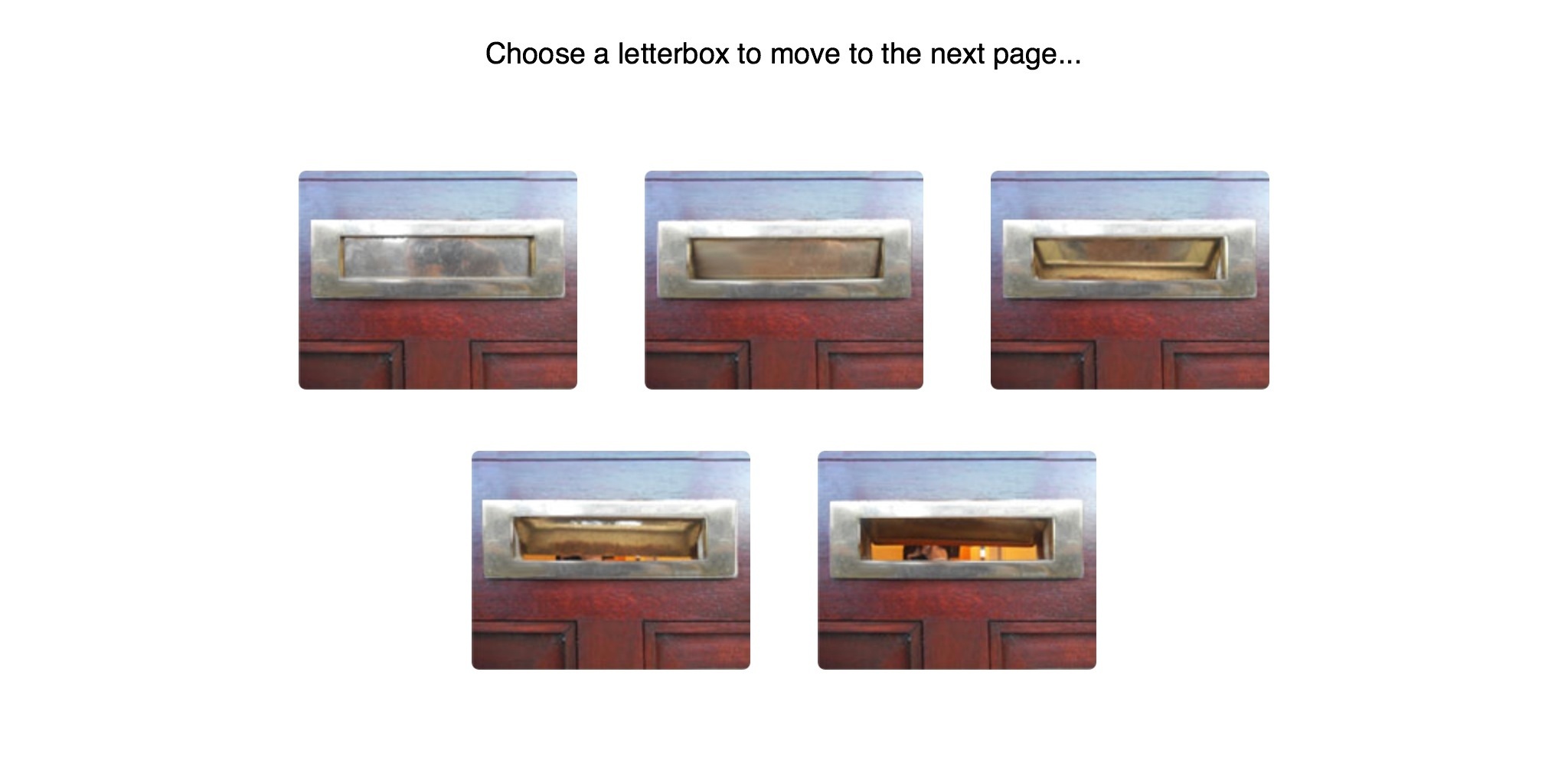 Results Top Left to Right: 73 | 41 | 15 | 21 | 97
Results…
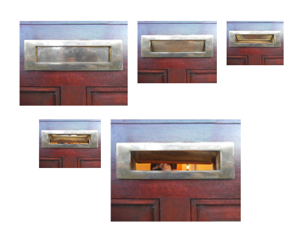
Top Left to Right: 73 | 41 | 15 | 21 | 97
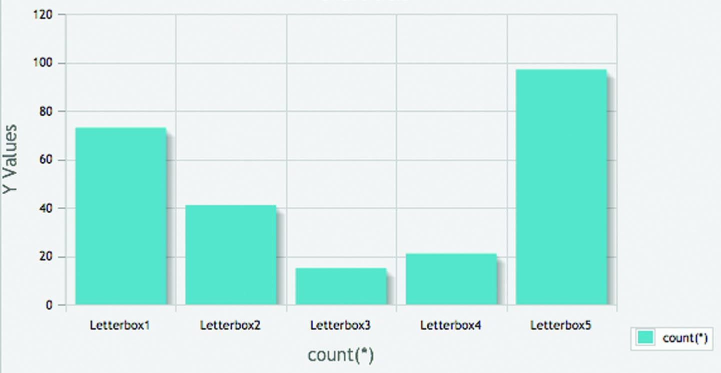
These results were interesting. As expected the majority clicked on the fully opened letter box however closely followed by the second most popular being the completely closed letterbox. The lowest result being on the half open, half closed letterbox.
Conclusion…
The most popular result was expected however there was a large number clicking on the closed letterbox. This could indicate several things such as the user does not need to see what sits behind/or is to follow, or they trusted and knew what was to follow enough to not wish to have a preview. Also those who use the web regularly do not ever see what’s coming up next when they click a button so therefore it’s not expected and hence choosing the letterbox here is what they are most familiar with and potentially it resembles a button itself-flat, slight relief, square/rectangular in shape.
Also another interesting result is the lowest click being in the half open/half closed one, this could suggest that the uncertainty here has really put people off and the user wants a more solid confident object.
…Doors.php
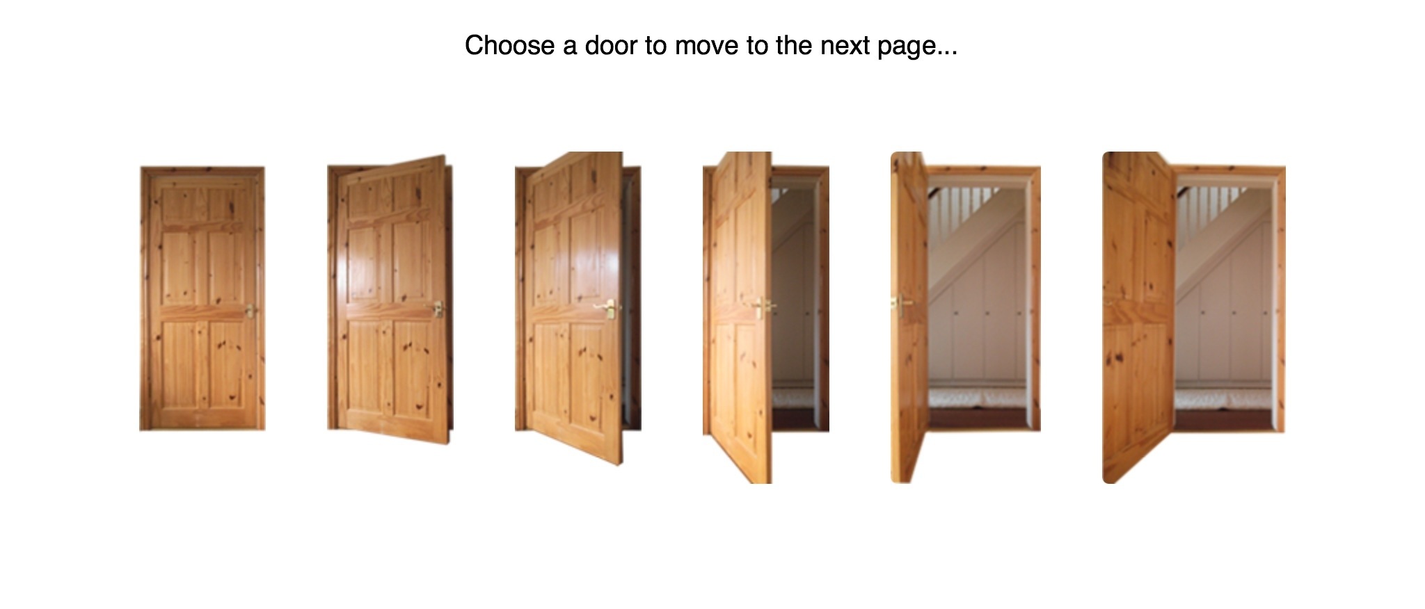 Results Left to Right: 34 | 32 | 34 | 39 | 43 | 58
Results…
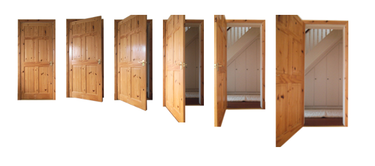
Left to Right: 34 | 32 | 34 | 39 | 43 | 58
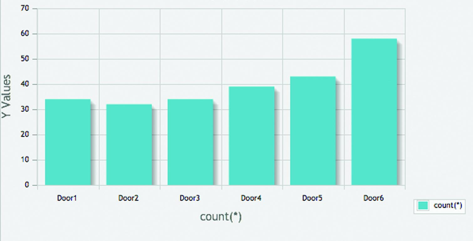
These results were far more dispersed however as expected the most clicked was the fully opened door.
Conclusion…
Due to the fact that these results where very evenly distributed it is hard to draw a complete conclusion on this one.
…Boxes.php
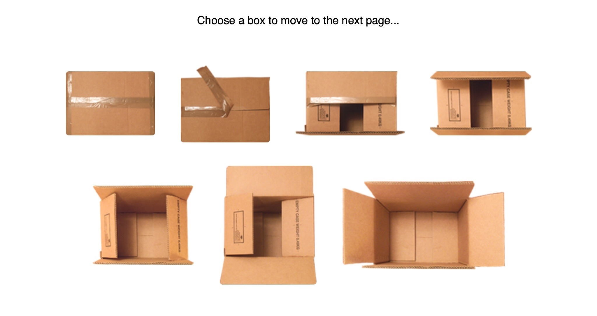 Results Top Left to Right: 26 | 27 | 15 | 14 | 24 | 20 | 117
Results…
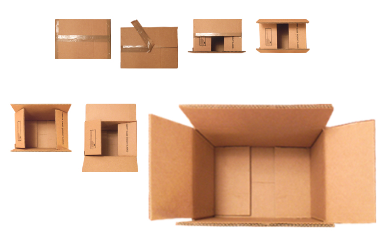
Top Left to Right: 26 | 27 | 15 | 14 | 24 | 20 | 117
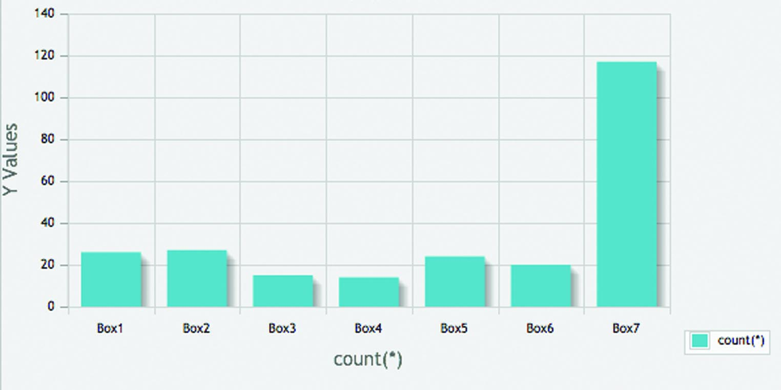
Here there is an obvious most popular result with 117 people clicking on the fully opened box, and as with the letterboxes the less clicking on the half open, half closed box.
Conclusion…
These results are, as with the letterboxes, what I expected with the majority clicking on the fully opened box as an indicator to proceed. This could be due to the fact that an object being open offers to continue on, come on in.
…Books.php
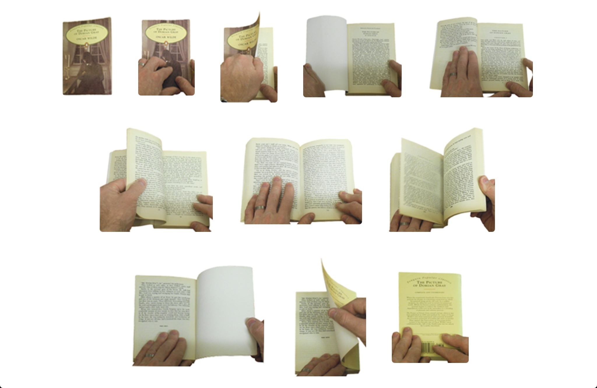 Results Top Left to Right: 52 | 13 | 33 | 29 | 19 | 19 | 40 | 10 | 8 | 6 | 17
Results…
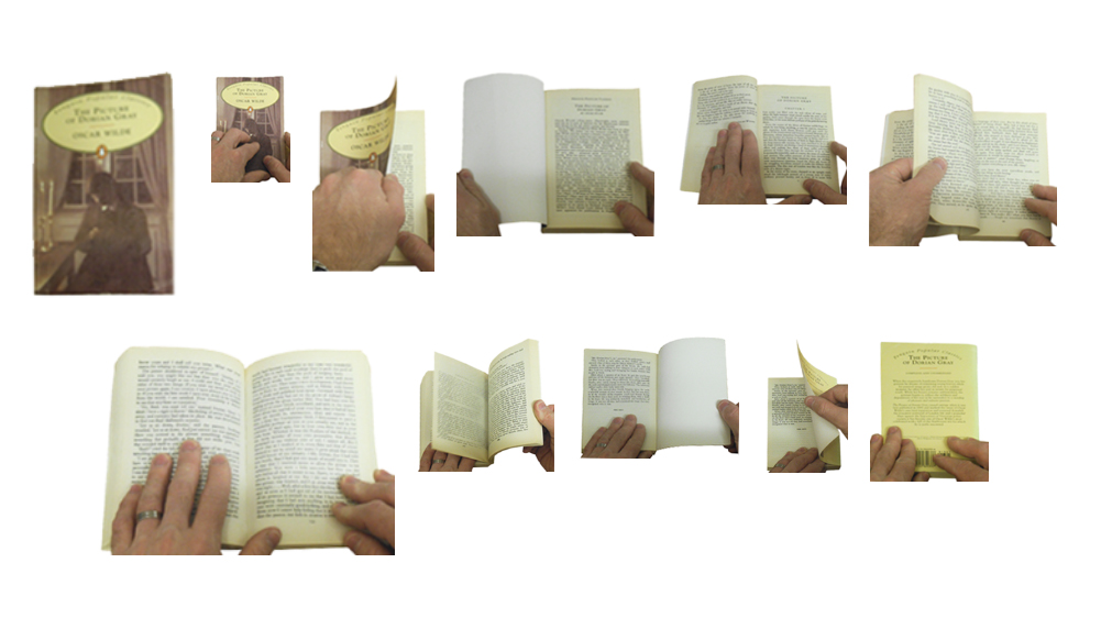
Top Left to Right: 52 | 13 | 33 | 29 | 19 | 19 | 40 | 10 | 8 | 6 | 17
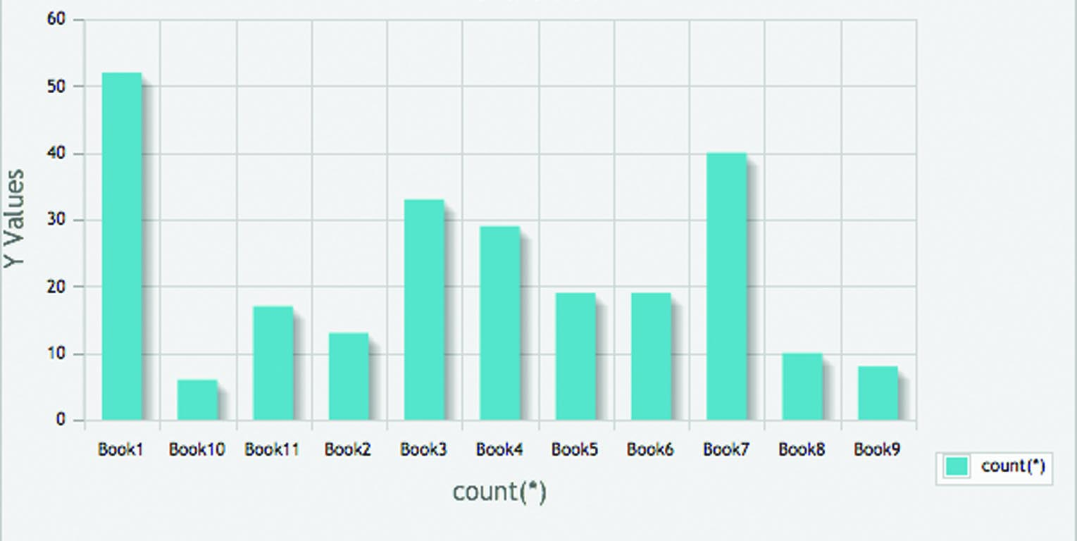
The results here are also fairly evenly dispersed as with the doors. Most clicked on the first book-closed showing the front cover, shortly followed by the fully opened book and also the first page being partially opened and lastly with the first page being fully opened.
Conclusion…
This is another one which is hard to conclude anything of significance as the results are fairly dispersed across fully open and fully closed options. One thing I could draw upon is the clicks seems to all come from the start of opening the book (the first few in the sequence) this could be concluded that its because it indicates the starting of and therefore to click on them would be to continue further/proceed. In conjunction with this the lesser clicks were on the books which were coming to an end/finish/close. It would be fair to suggest that the user has become confused with mixing real with virtual and this would explain the random results.
What I would do differently…
With regards to the investigation on real life objects open or closed I think further investigation would need to done to reveal a pattern. At this stage I think there is no role this concept has to play to benefit the web as it appears the users have become confused but I think if these concepts were placed amongst buttons and such like navigational elements it would be interesting to see then when given the choices how people would respond to something familiar to that environment it sits in.
Familiar Nursery Rhymes
This concepts comes from another of McCloud’s theories. He believed that sequential art is important in ensuring the thread is followed and with ease. ‘sequential art – visual art in sequence – each frame must occupy its own space.’ ‘Juxtaposed pictorial and other images in deliberate sequence, intended to convey information and/or to produce an aesthetic response in the viewer.’ ‘Meanwhile, pictures in sequence are finally being recognised as the excellent communication tool that they are…’ ‘Like with comics, websites involve storytelling filling in the gaps to work out what happens next…it’s the inquisitive that’s then that is pulled out that aids progression.’
In reflection of McCloud’s theories I wanted to take this and expand it in the web environment, a place where people supposedly spend very little time on each page to look at things in detail. In doing so I have used very familiar nursery rhymes that nearly everyone should know.
I have chosen two nursery rhymes, Jack and Jill and Humpty Dumpty and illustrated the rhymes/story in a sequence of 4, both contain the real ending and an alternative ending to see where the user clicks when needing to think about something as a flow/story.
Expected Results…
I was not quite sure what I expected from these results. I would suggest that due to the limited time users tend to spend on pages of a website there could be potential slip ups as they may not look closely enough and for long enough to provide the correct click.
…Jack-and-Jill.php
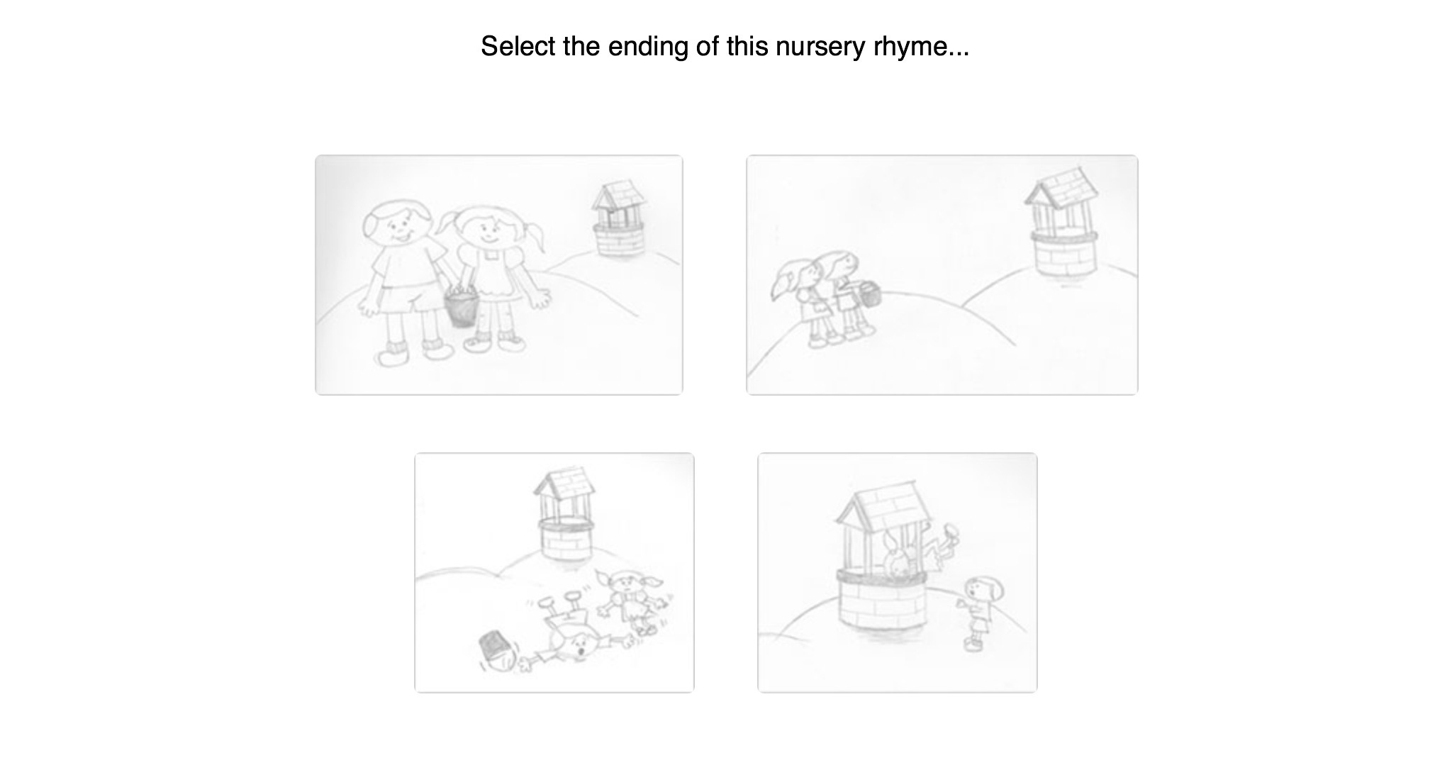 Results Top Left to Right 13 | 4 | 205 | 23
Results…
Top Left to Right 13 | 4 | 205 | 23
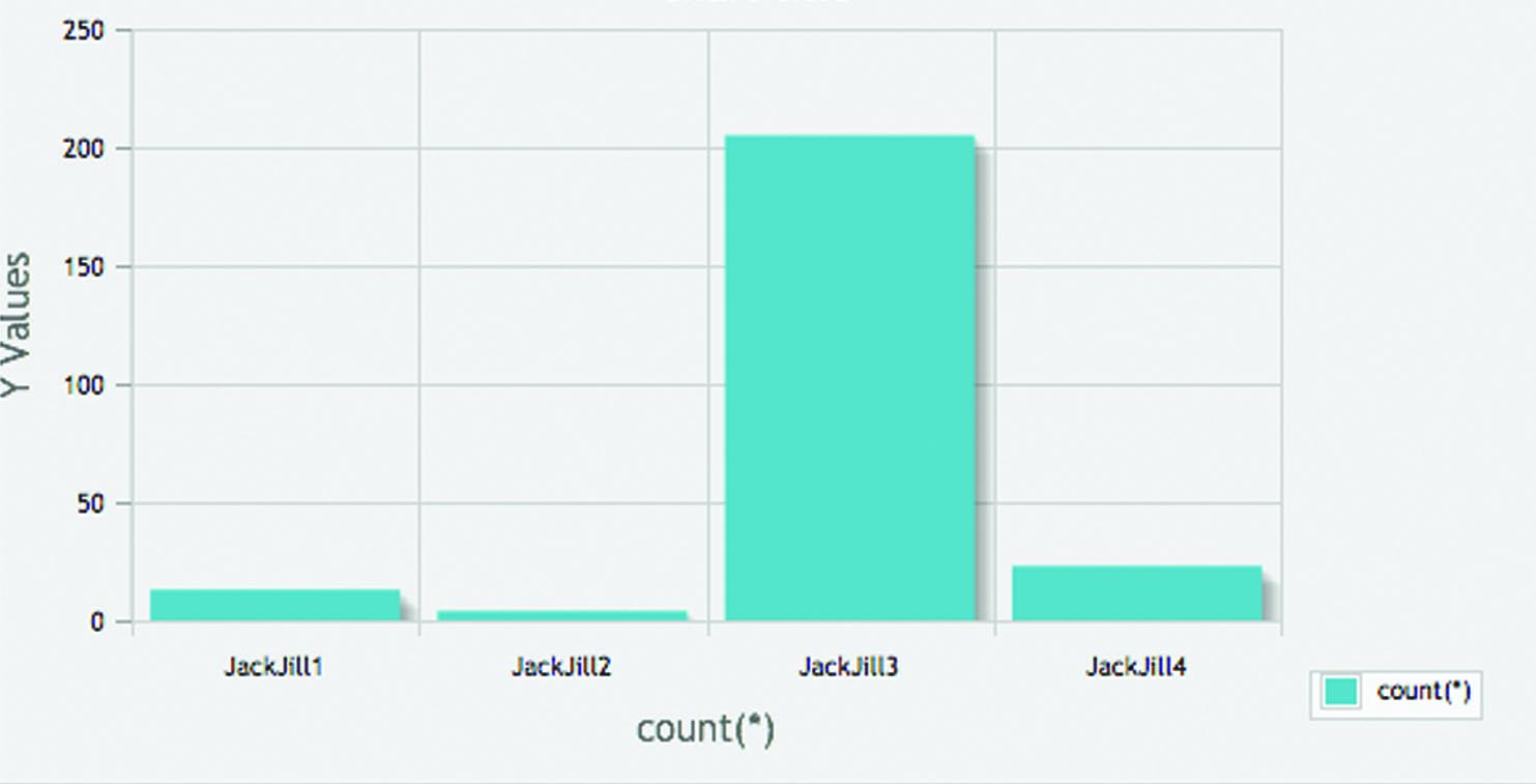
A significantly large number of people clicked on the corrent ending to the nursery rhyme
…HumptyDumpty.php
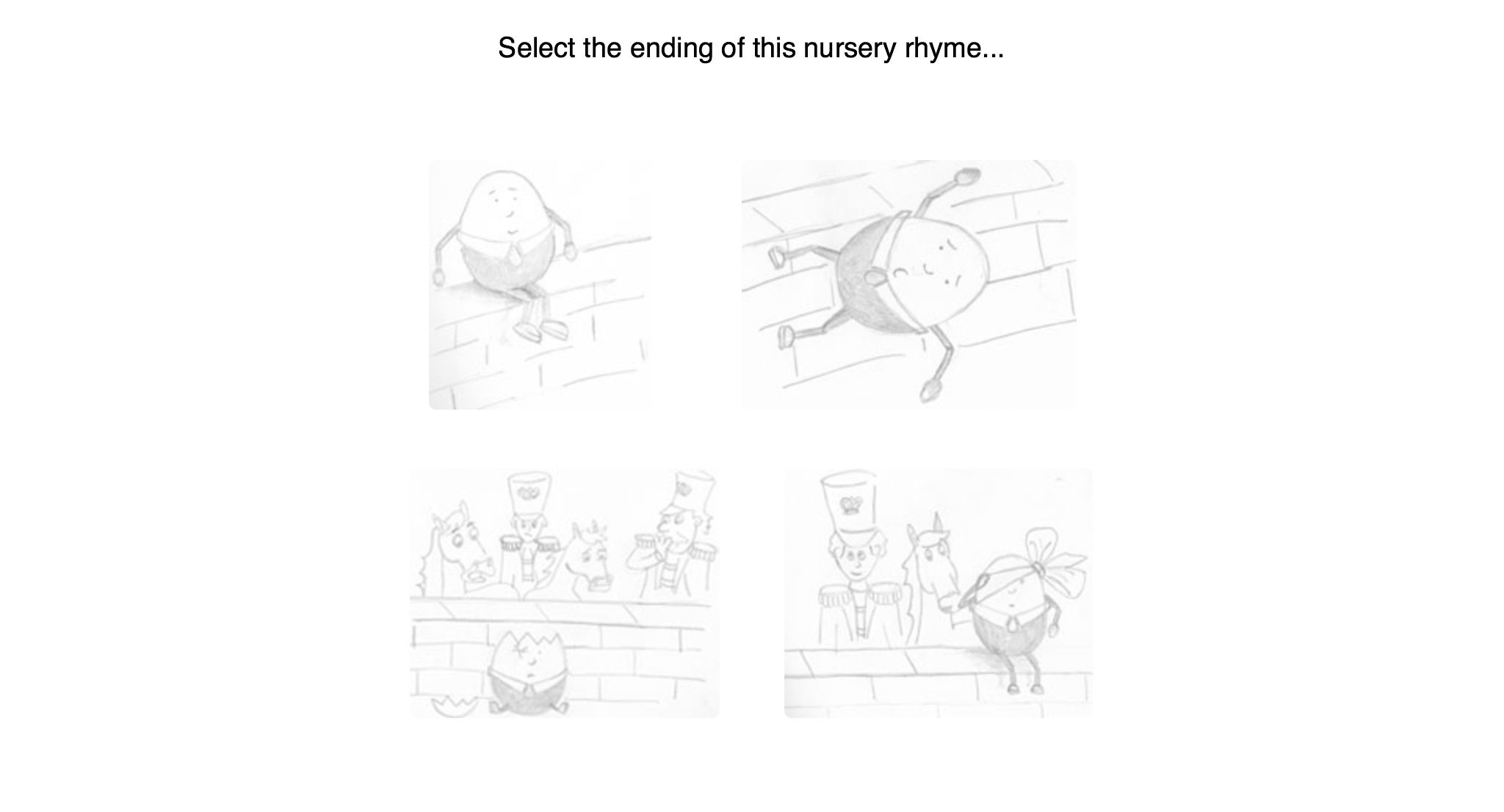 Results Top Left to Right: 7 | 15 | 117 | 107
Results…
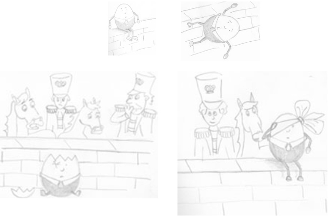
Top Left to Right: 7 | 15 | 117 | 107
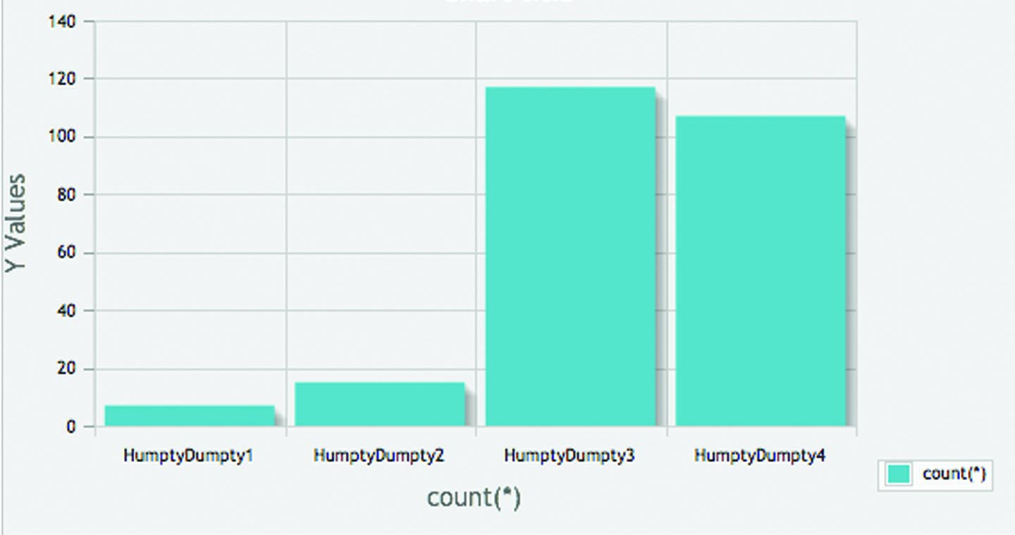
Interestingly there is a high number clicking on the last 2 illustrations, 117 on the second from last and 107 on the last – the incorrect/alternative ending.
Conclusion…
To conclude I think it would be fair to suggest that the alternative ending confused people a little on Humpty Dumpty. Several reasons could be for this, limited time, therefore rushing without looking at the detail. When comparing the two nursery rhymes you could summarise that the reason the majority got Jack and Jill right could be due to the unhappy ending and spending some more time, potentially looking for a more positive solution, whereas the results of the Humpty Dumpty one are so close this could indicate that people like to see a happy ending, finding a positive solution, hence selecting the alternative and incorrect ending of Humpty Dumpty being put back together again.
What I would do differently…
I would like to continue with this study by expanding the Jack and Jill one to have a happy ending and see if this changes the results then concluding that people seek for happier, more positive image.
Frame.php
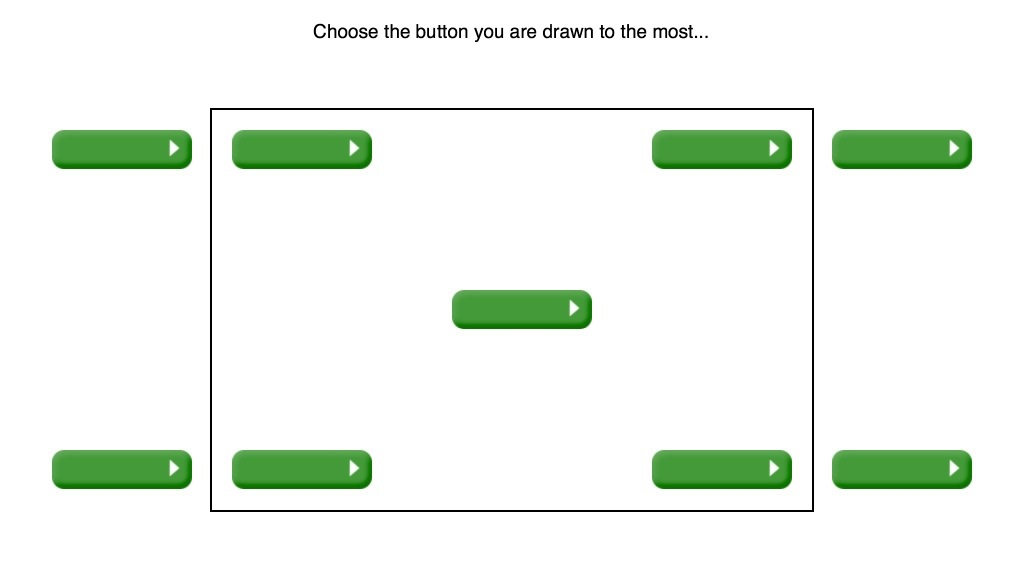
Results Top Left across to Bottom Right: 22 | 51 | 18 | 12 | 121 (centre) | 0 | 6 | 16 | 6
Several concepts from my research and experience are encompassed in this page. The border/frame comes from the Gestalt theory of proximity and the Framing Effect which focuses and contains the user driving them to not get distracted and focus on a specific element/goal. In addition I was keen to investigate the placement of buttons in this and where people are most drawn to on a page.
Expected Results…
I expected here that people would be drawn to the right side of the page as this is customary location for a button to proceed onwards to the next page.
Results…
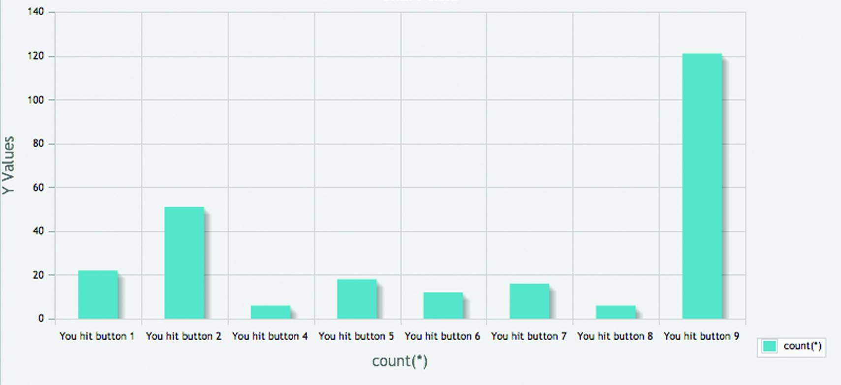
Top Left across to Bottom Right: 22 | 51 | 18 | 12 | 121 (centre) | 0 | 6 | 16 | 6
A very clear favourite from the 121 clicks was the very centre button. With the second being the top, second in from left.
Conclusion…
This result does not come as a surprise and is very interesting. It’s the centre of the screen and suggests the first place people engage with when they land on a site. The second, with 51 clicks does come as a slight surprise as this would normally indicate going back however it could suggest that as people read from left to right generally in western culture this is one of the first places they look hence where they click.
What I would do differently…
I would like to expand this same test and play with the use of colour to see if this changes people’s reactions. Also I would be keen to take the border away, as suggested by McCloud ‘these various shapes we call panels hold in their borders all of the icons that add up to the vocabulary of comics.’ He continues on to explain that ‘Most of us are so used to the standard format that a ‘border less’ panel…take on a timeless quality.’ If the border no longer existed what would people do how would they move around the Internet, would their focus change?
Buttons.php
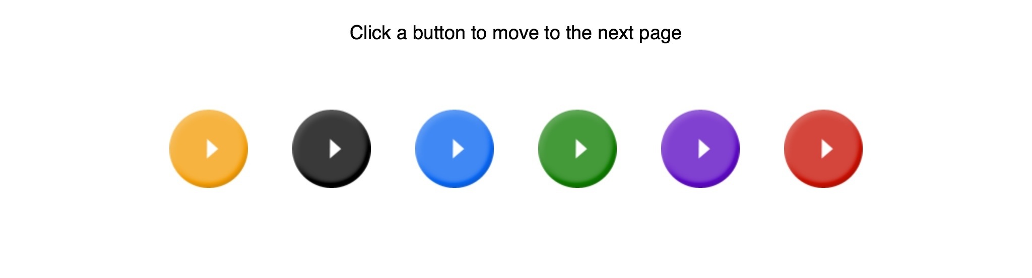 Results Left to Right: 19 | 23 | 60 | 51 | 49 | 39
In this one I was wanting to understand the importance of colour on the web. Many texts say this is very important in particular the work of Susan M Weinshcenk who claims, ‘Colors have associations and meanings, for example, red means “in the red” or financial trouble, or it could mean danger or stop. Green means money and “go”. Pick your colors carefully since they have these meanings.” p27. But is it really appropriate to make claims of how we should be designing the web by referencing rules in nature…a completely different environment to that of a 2 dimensional screen? As Hall discusses in his work, “colours do not have any ‘true’ or fixed meanings…Red does not mean ‘Stop’ I nature, anymore than Green means ‘Go’. p26. I have to agree with Hall’s statement and am interested in drawing in this further to better justify my thoughts on this.
Expected Results…
With the preconceived rules being followed in the industry it would be fair to suggest green would be clicked on the most as a button to ‘go’ or ‘proceed’ and that red would be avoided as a colour that represents ‘stop’ or ‘danger’ in reality.
Actual Results…
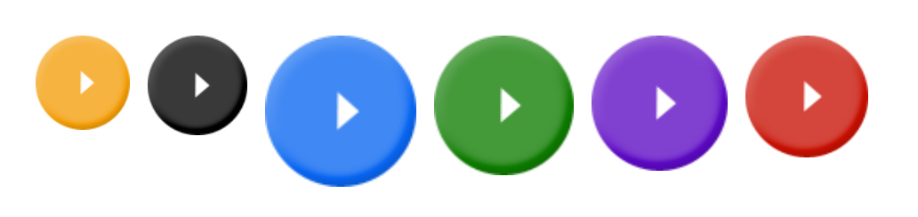
Left to Right: 19 | 23 | 60 | 51 | 49 | 39
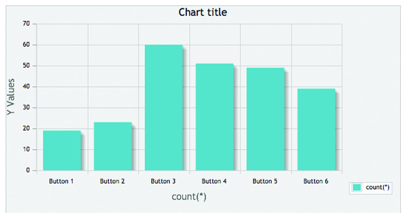
The results here are very equally spread with no real prominence in response. The most clicked was blue shortly followed by green, purple and red
Conclusion…
I must admit I am extremely pleased to see no significant in a particular colour evoking a reaction. It would be fair to suggest following this that colour does not matter so much, particular when used in such small quantity. What makes people click could be many other factors such as positioning, icon, wording etc.
What I would do differently…
I would definitely like to investigate this further as this suggests colour is not of such importance, what would happen if the symbol on the button changes, or the shape of the button changes. I would have liked to have completed stripped the buttons bare and make the buttons flat, without any relief taking the concept of a physical button completely away.
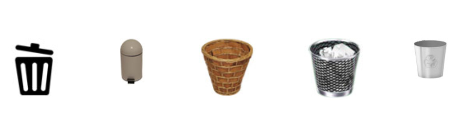
Bins.php
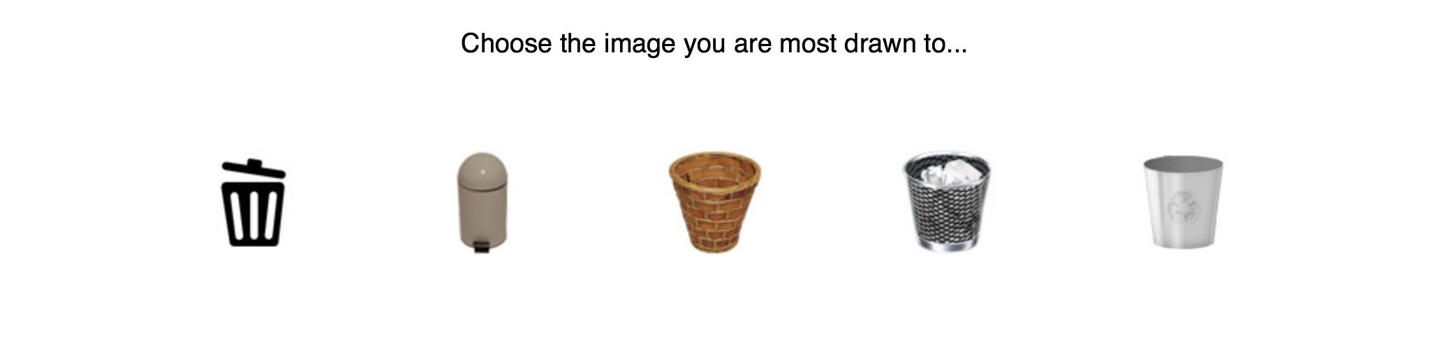 Results Left to Right: 73 | 29 | 62 | 67 | 18
In this piece I wanted to continue playing with the concept of real life objects and icons immersed in to a digital environment, with the use of bins. These feature as icons on all computers so has this meant that people will be drawn to the known within real life or within digital as they are immersed in it at the time of selection.
Expected Results…
I thought that age and experience on the computer would be a factor here with the older generation selecting a real object and the younger generation choosing the symbols.
Actual Results…
Left to Right: 73 | 29 | 62 | 67 | 18
Highest number of clicks on a bin was bin 4 followed by bin 1 – both icons and both from the age range of 25 to 34.
For the older generation the highiest number clicked on bin 3 – the image of a real bin.
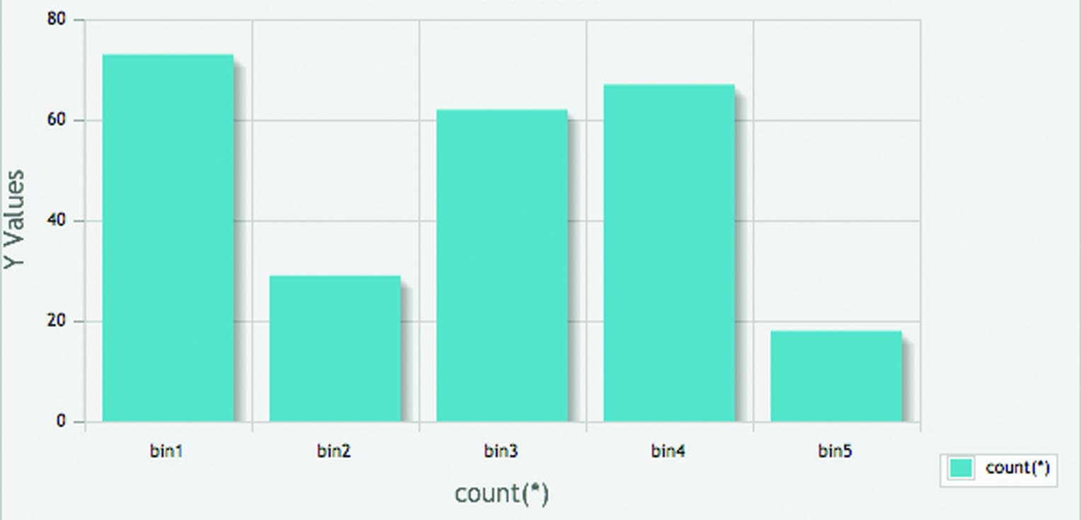
Interestingly the most clicked was the black icon of the bin, shortly followed by the image bin known within Apple products, extremely closely followed by the real wicker bin.
Conclusion…
I could suggest looking at these results that the more simple the symbol, the easier or quicker people recognise it, irrespective of its location or relation to the web. The wicker basket sits central on the screen which could have a impact on its high number of clicks but this could be due to the age range this was distributed too.
In addition, above shows the two most popular, one very simple but the other could be considered high quality with its chrome shimmer, and this could be another reason for its attractiveness to the user.
What would I do differently…
I would like to explore the difference and impact a simple icon verses a more detailed one has on the user. Detail may not benefit but some time spent on producing quality imagery may play a key role in how the user interacts…quality potentially draws in interest and trust.
List of References:
Bradley, S. (2010). The Framing Effect: Influence Your Audience By Setting The Context. Retrieved from http://www.vanseodesign.com/web-design/framing-expectation-exposure-effect/
Davis, C. (2005). Finding and Knowing. Psychology, Information and Computers. London, United Kingdom: Routledge.
Drucker, J. (1994, 2004). The Book as Sequence: Narrative and Non-Narrative. The Century of Artists’ Books. New York, NY: Granary Books.
Drucker, J., & McVarnish, E. (2009). Digital design after the 1970s. Graphic Design History. A Critical Guide (pp. 323-339). United States of America: Pearson Education.
Gleitman, H., Rozin, P., & Sabini, J. (1997). Solomon E. Asch (1907–1996): Obituary, 52(9), pp. 984-985.
Gordan, I. E. (1989). Theories of Visual Perception. United Kingdom: John Wiley & Sons Ltd.
Hall, S. (1997). Chapter 1. Representation, meaning and language. Representation: Cultural representations and signifying practices (pp.15-29). London, United Kingdom: SAGE/Open University.
Hollis, R. (2001). Graphic Design. A Concise History. (pp.186-223). London, UK: Thames & Hudson Ltd.
Meggs, P. (1998). The Digital Revolution. A History of Graphic Design (pp. 455-475). United States of America: John Wiley & Sons, Inc.
Mirzoeff, N. (1999). Introduction. What is visual culture? An Introduction to Visual Culture. United Kingdom: Routledge.
Mirzoeff, N. (2002). The Visual Culture Reader. (2nd ed.). United Kingdom: Routledge.
Mirzoeff, N. (2009). An Introduction to Visual Culture. (2nd ed.). United Kingdom: Routledge.
Oxford Dictionaries. What’s new? (February 2013). Retrieved from http://oxforddictionaries.com/words/what-s-new
Sturken, M., & Cartwright, L. (2001) The Internet: global village or multinational corporate marketplace? Practices of Looking. An Introduction to Visual Culture. Oxford, NY: Oxford University Press Ltd.
Weinschenk, S. M. (2009). Neuro Web Design. Berkeley, CA: New Riders.
Weinschenk, S. M. (2011). 100 Things Every Designer Needs to Know About People. Berkeley, CA: New Riders.
Bibliography:
Bradley, S. (2010). The Framing Effect: Influence Your Audience By Setting The Context. Retrieved from http://www.vanseodesign.com/web-design/framing-expectation-exposure-effect/
Behrens, R. R. (1998). Art, Design and Gestalt Theory. Leonardo 31(4), 299-303
Bonnici, P. (1999). Visual Language. The Hidden Medium of Communication. Switzerland: RotoVision SA.
Davis, C. (2005). Finding and Knowing. Psychology, Information and Computers. London, United Kingdom: Routledge.
Drucker, J. (1994, 2004). The Book as Sequence: Narrative and Non-Narrative. The Century of Artists’ Books. New York, NY: Granary Books.
Drucker, J., & McVarnish, E. (2009). Digital design after the 1970s. Graphic Design History. A Critical Guide (pp. 323-339). United States of America: Pearson Education.
Gleitman, H., Rozin, P., & Sabini, J. (1997). Solomon E. Asch (1907–1996): Obituary, 52(9), pp. 984-985.
Gordan, I. E. (1989). Theories of Visual Perception. United Kingdom: John Wiley & Sons Ltd.
Hall, S. (1997). Chapter 1. Representation, meaning and language. Representation: Cultural representations and signifying practices (pp.15-29). London, United Kingdom: SAGE/Open University.
Hollis, R. (2001). Graphic Design. A Concise History. (pp.186-223). London, UK: Thames & Hudson Ltd.
Joinson, A. N. (2003). Understanding the Psychology of Internet Behaviour. Virtual Worlds, Real Lives. Basingstoke, UK: Palgrave Macmillan.
Krugg, S. (2006). Don’t Make Me Think! A Common Sense Approach to Web Usability, Second Edition. United States of America: New Riders.
Lindgaard, G., Fernandes, G., Dudek, C., & Brown, J. (2006). Attention web designers: You have 50 milliseconds to make a good first impression! Behaviour and Information Technology, 25(2), pp. 115-126.
McCloud, S. (1993). Understanding Comics. The Invisible Art by Scott McCloud. United States of America: HarperCollins Publishers, Inc.
Meggs, P. (1998). The Digital Revolution. A History of Graphic Design (pp. 455-475). United States of America: John Wiley & Sons, Inc.
Mirzoeff, N. (1999). Introduction. What is visual culture? An Introduction to Visual Culture. United Kingdom: Routledge.
Mirzoeff, N. (2002). The Visual Culture Reader. (2nd ed.). United Kingdom: Routledge.
Mirzoeff, N. (2009). An Introduction to Visual Culture. (2nd ed.). United Kingdom: Routledge.
Moggridge, B. (2007). Designing Interactions. United States of America: MIT Press.
Oh, H., & Price, J. (2012). How do storefront window displays influence entering decisions of clothing stores? Journal of Retailing and Consumer Services 19(1), pp. 27-35.
Oxford Dictionaries. What’s new? (February 2013). Retrieved from http://oxforddictionaries.com/words/what-s-new
Rock, I. (1990). The Legacy of Solomon Asch: Essays in Cognition and Social Psychology. Hillsdale NJ: Psychology Press.
Sturken, M., & Cartwright, L. (2001) The Internet: global village or multinational corporate marketplace? Practices of Looking. An Introduction to Visual Culture. Oxford, NY: Oxford University Press Ltd.
Wallace, P. (1999). The Psychology of the Internet. Cambridge, UK: Cambridge University Press.
Weinschenk, S. M. (2009). Neuro Web Design. Berkeley, CA: New Riders.
Weinschenk, S. M. (2011). 100 Things Every Designer Needs to Know About People. Berkeley, CA: New Riders.
